Nickelodeon Rebranding
I was in charge of directing the art of the proposal for Nickelodeon's rebranding pitch. Nickelodeon is seeking to reconnect with the personality that made it great in its early days. The irreverent humor, it's attraction to the absurd, that careless attitude that made the brand so lovable and human.
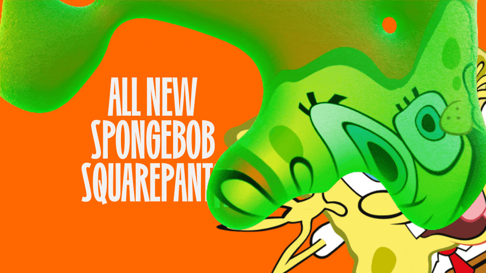
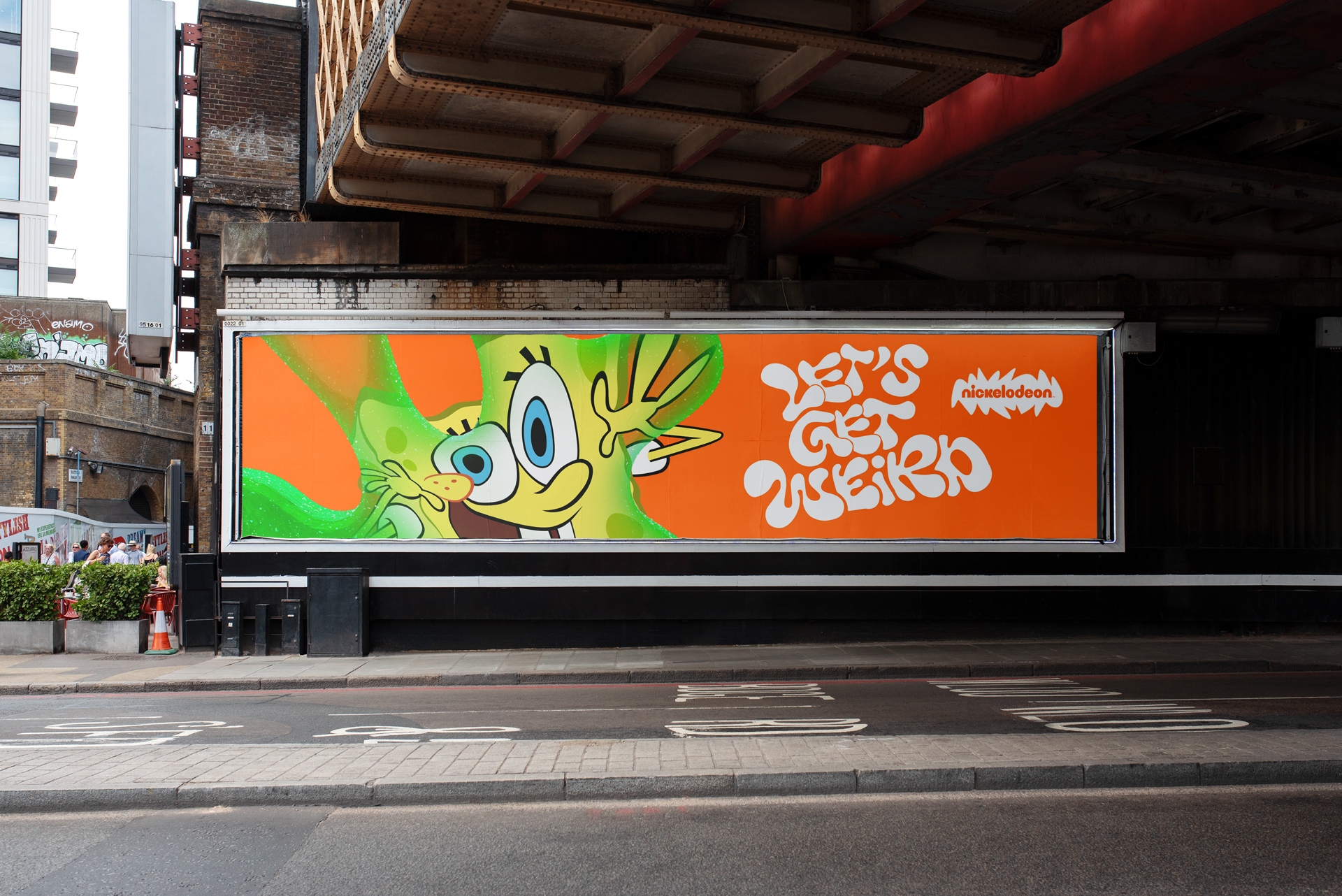
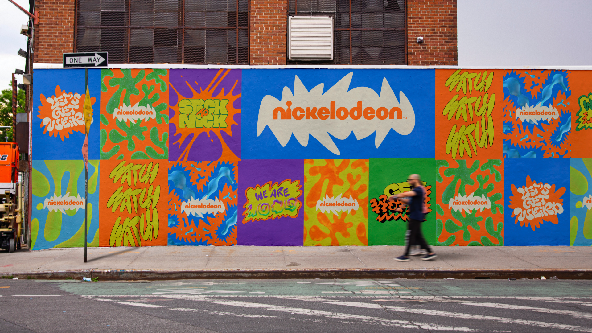
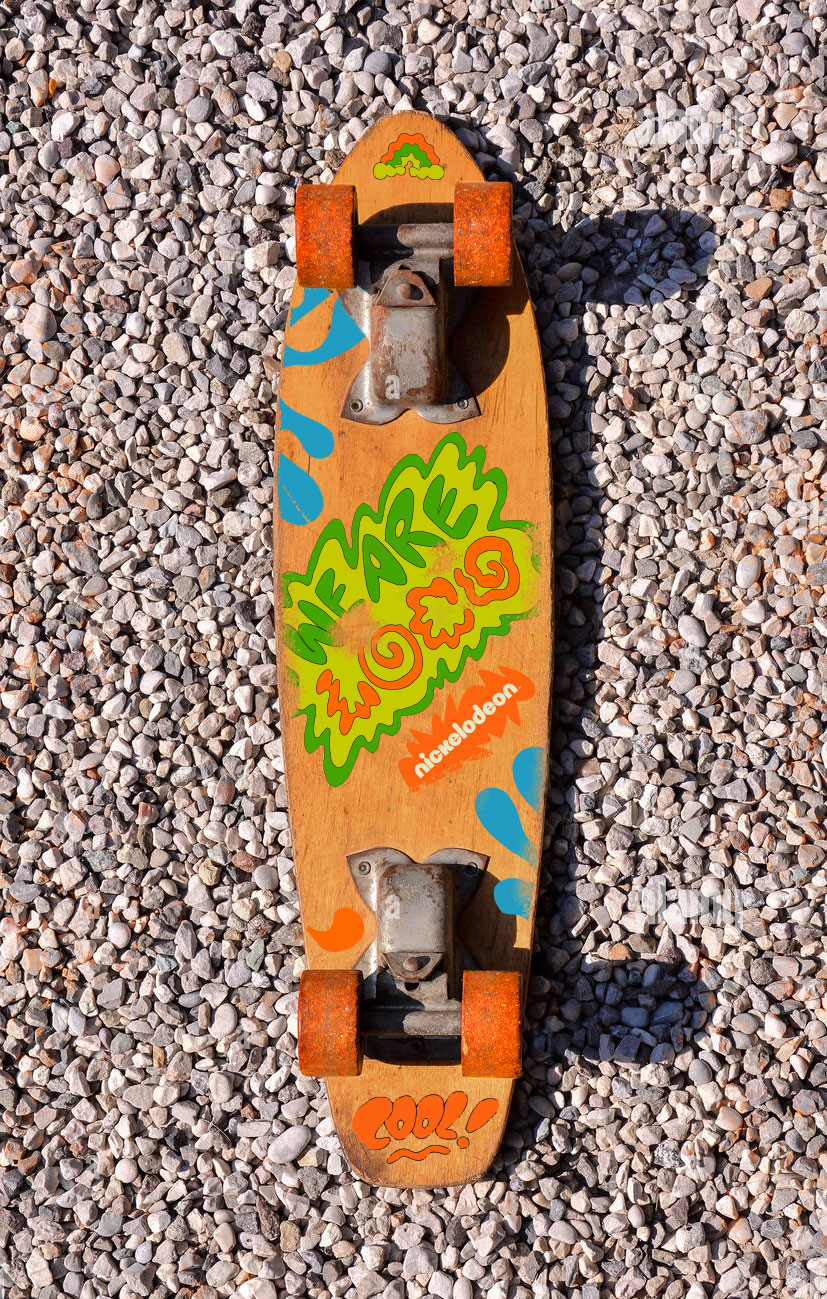
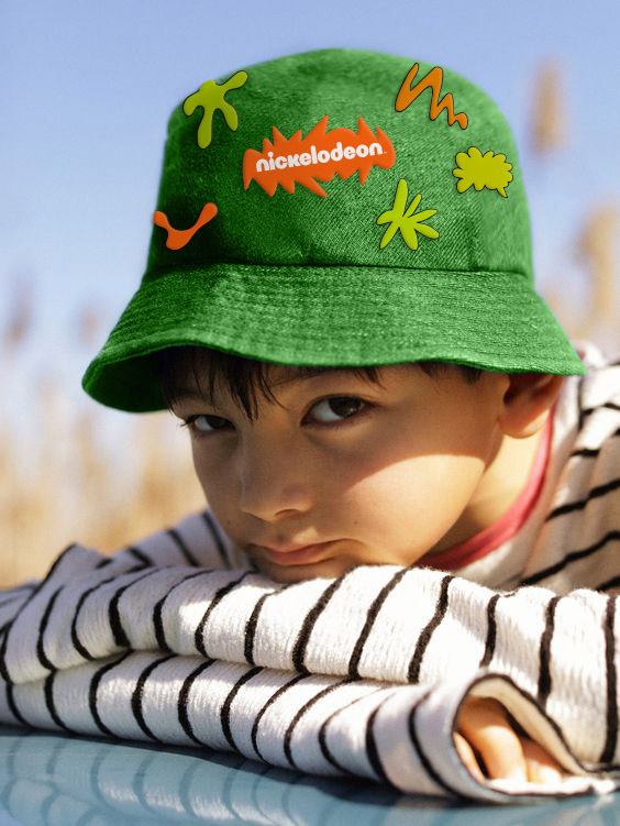
For this new visual identity I took inspiration from Nickelodeon's unforgettable icon: the splat. But instead of using it directly, we're using its attributes, its fluidity and restlessness. Are you ready? Let's get weird!
Logo
The logo was facing a challenge when applied in streaming apps, it needed to stand out more. I developed a container shape to highlight it, this comes from a handdrawn version of the word, the letters stick to each other and create the container shape.
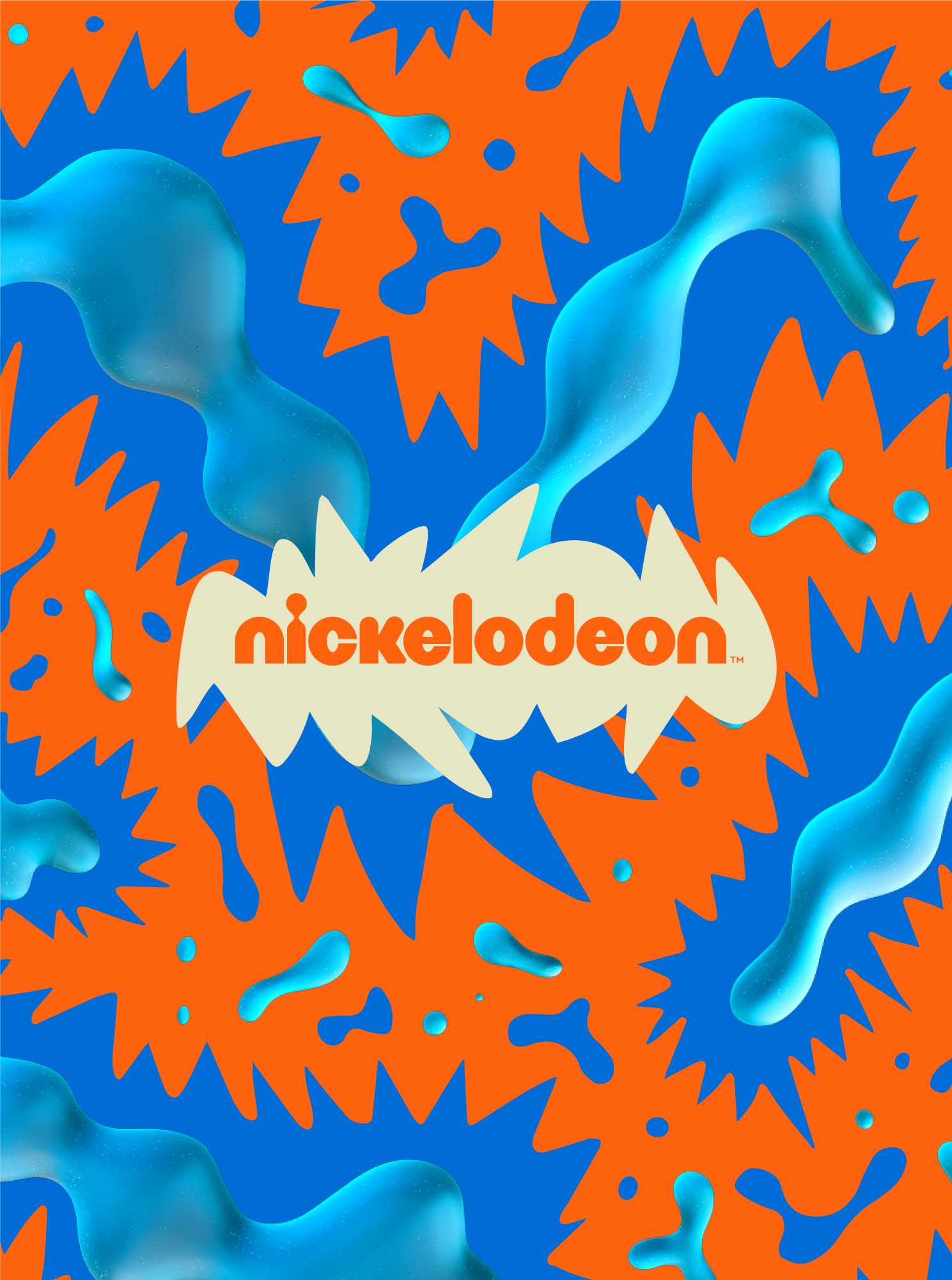
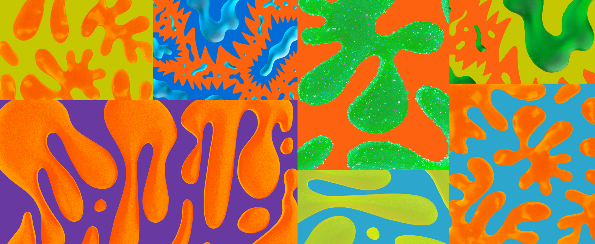
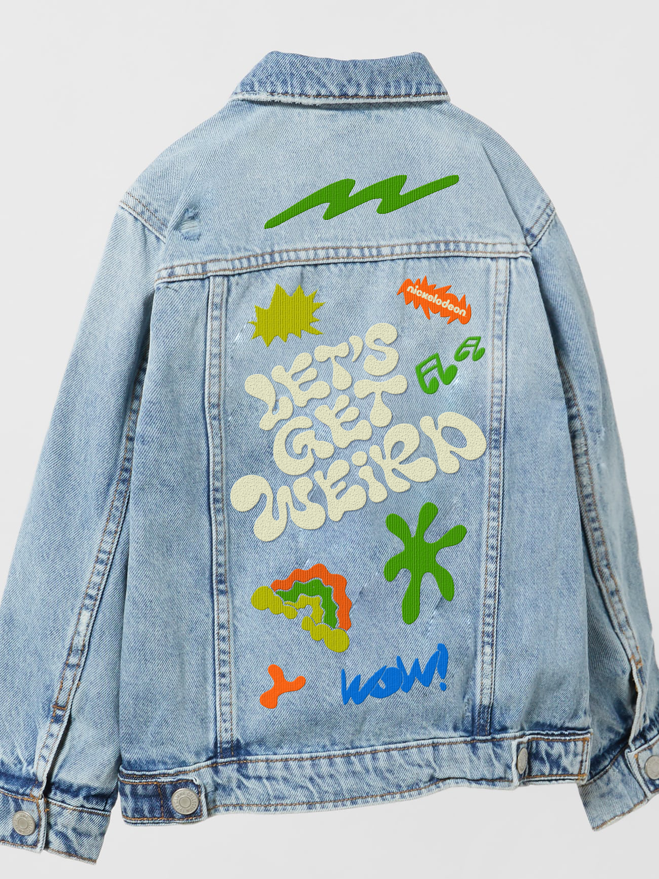
Patterns
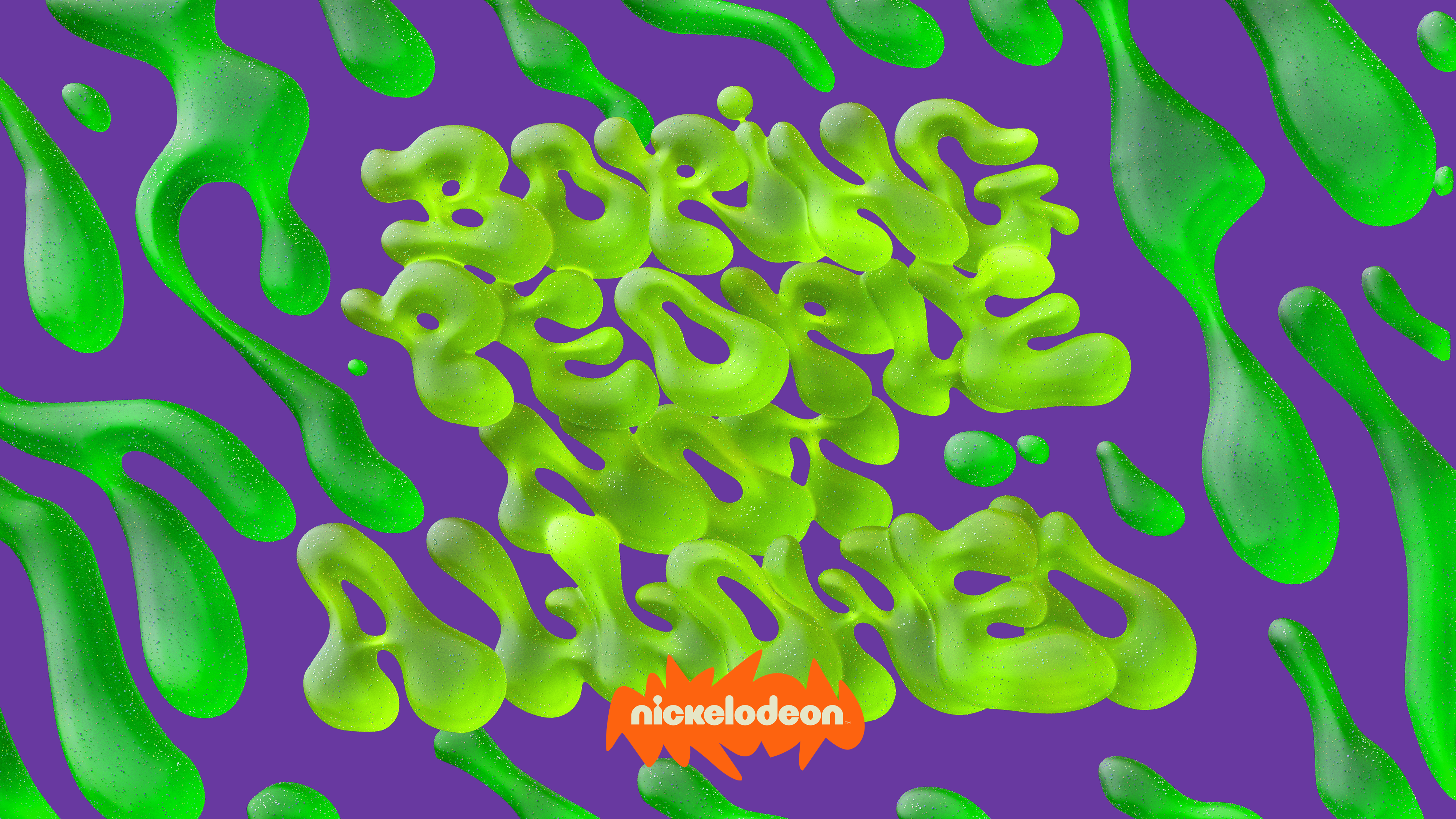
I created a set of dynamic and sparky patterns with a tangy color palette. The electric colors vibrate with each other generating a dynamic optical illusion. The 3D texture and animation was all about making it irresistibly satisfying. Unpredictable elastic movement and an irresistible soft texture that triggers that inexplicable feeling we all know and makes you want to look at it for hours, makes you want to squeeze it, or eat it. Does that make sense? It doesn’t have to.
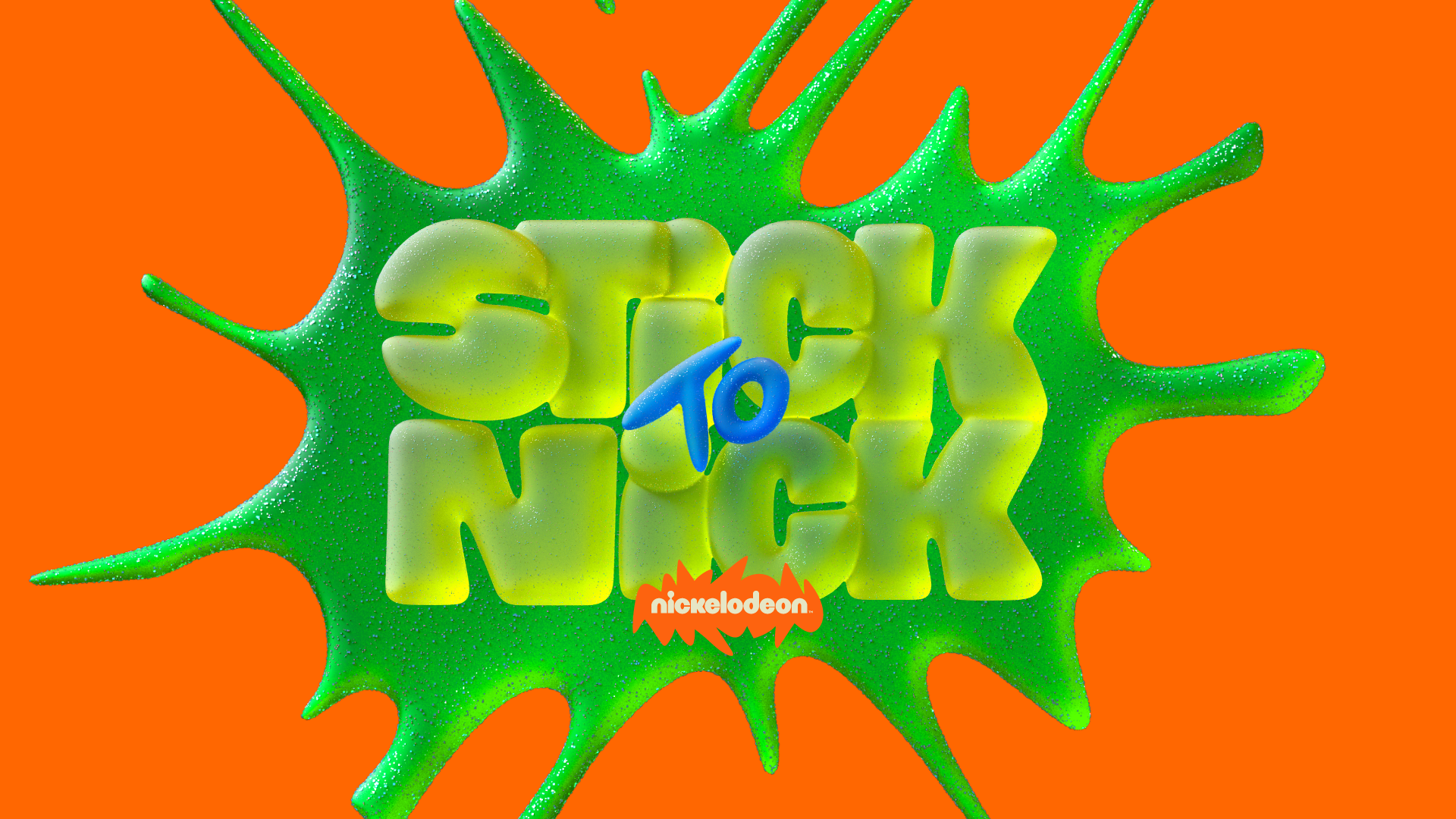
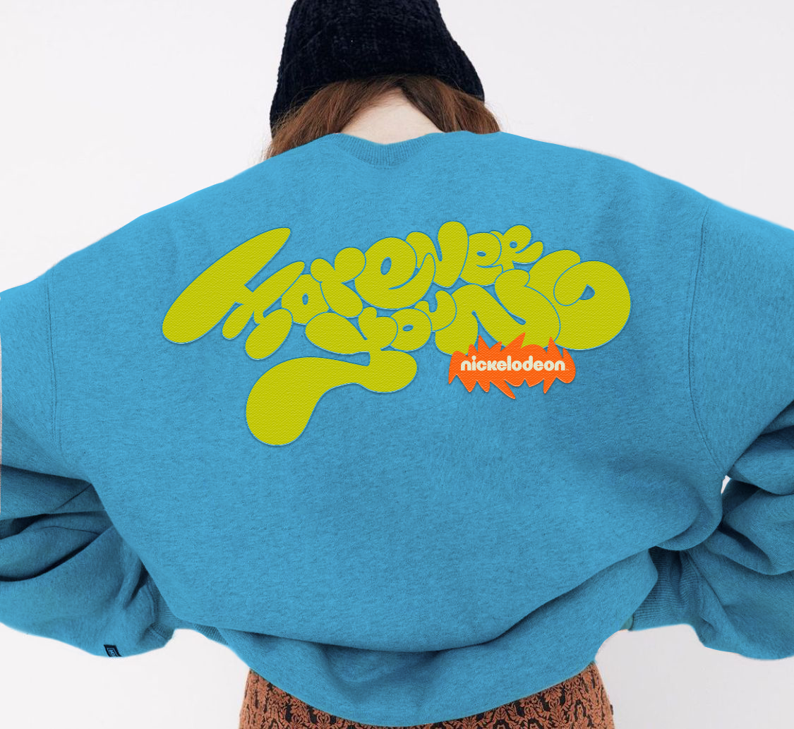
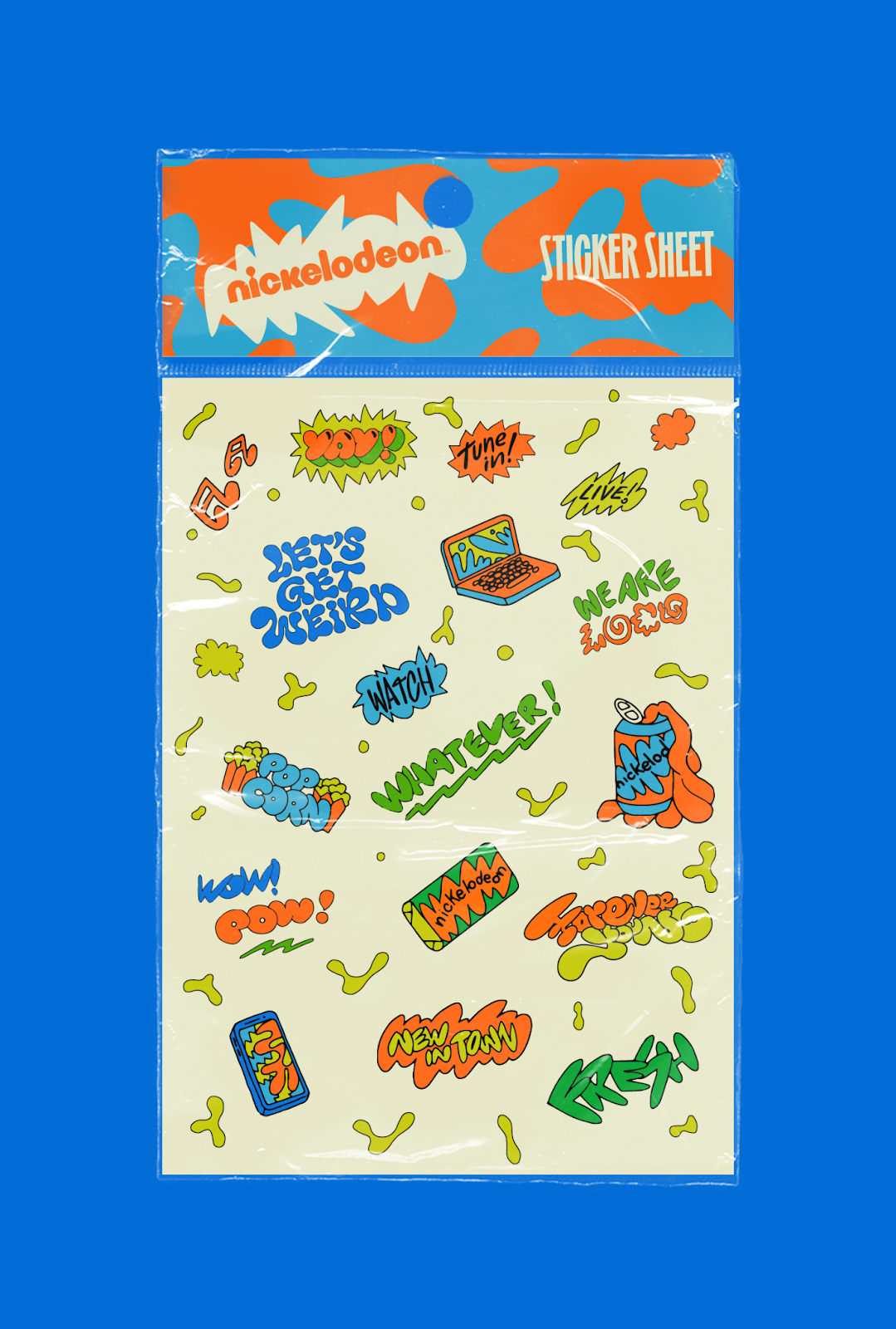
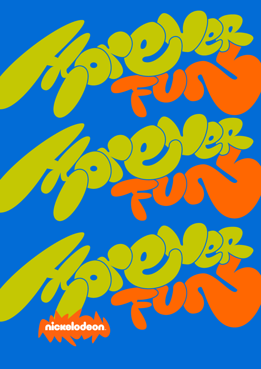
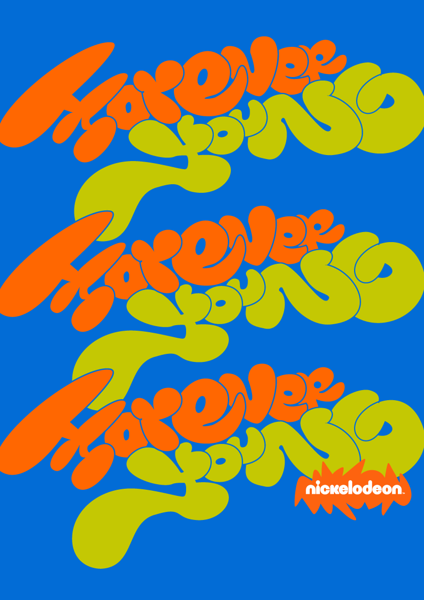
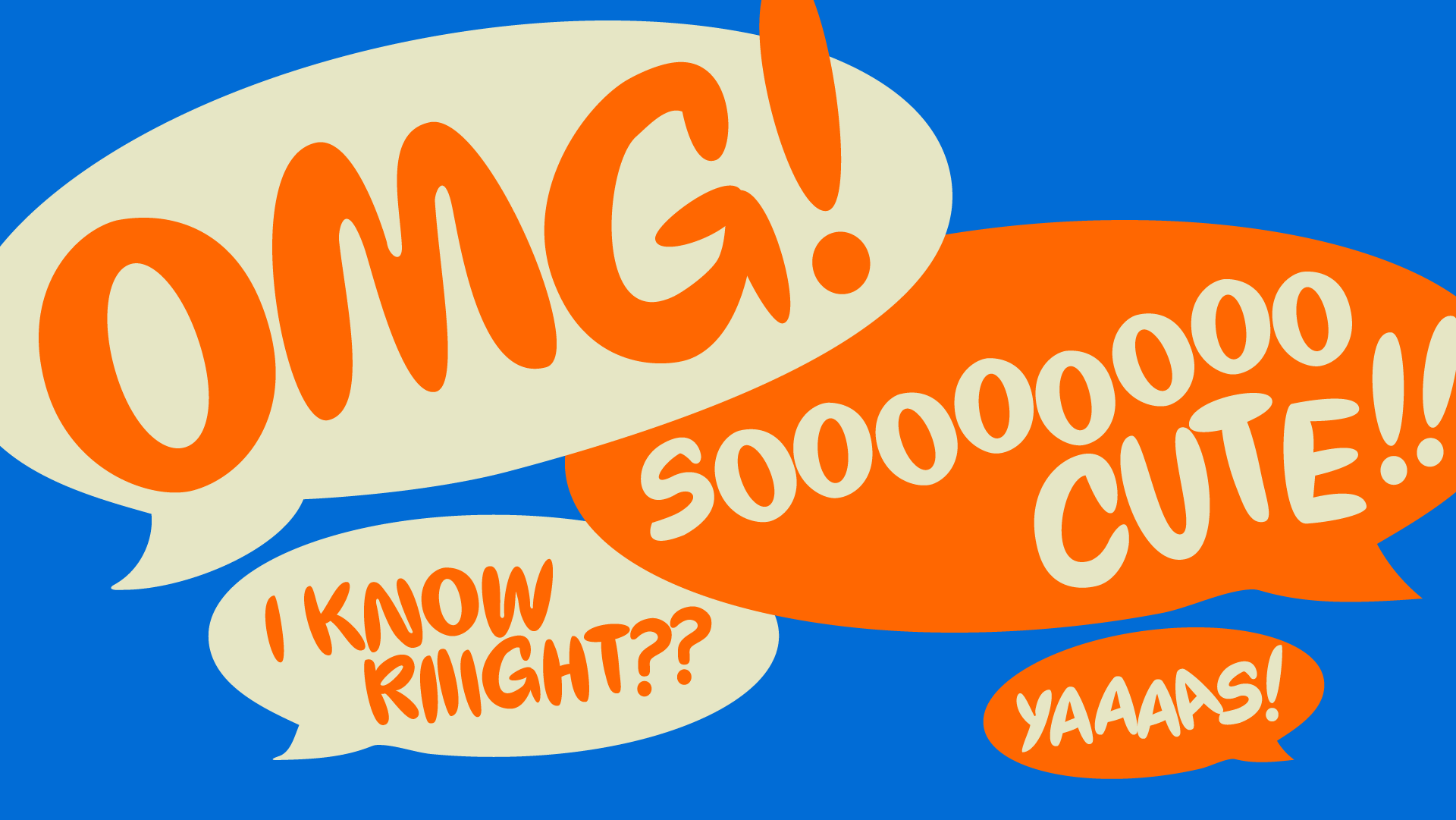
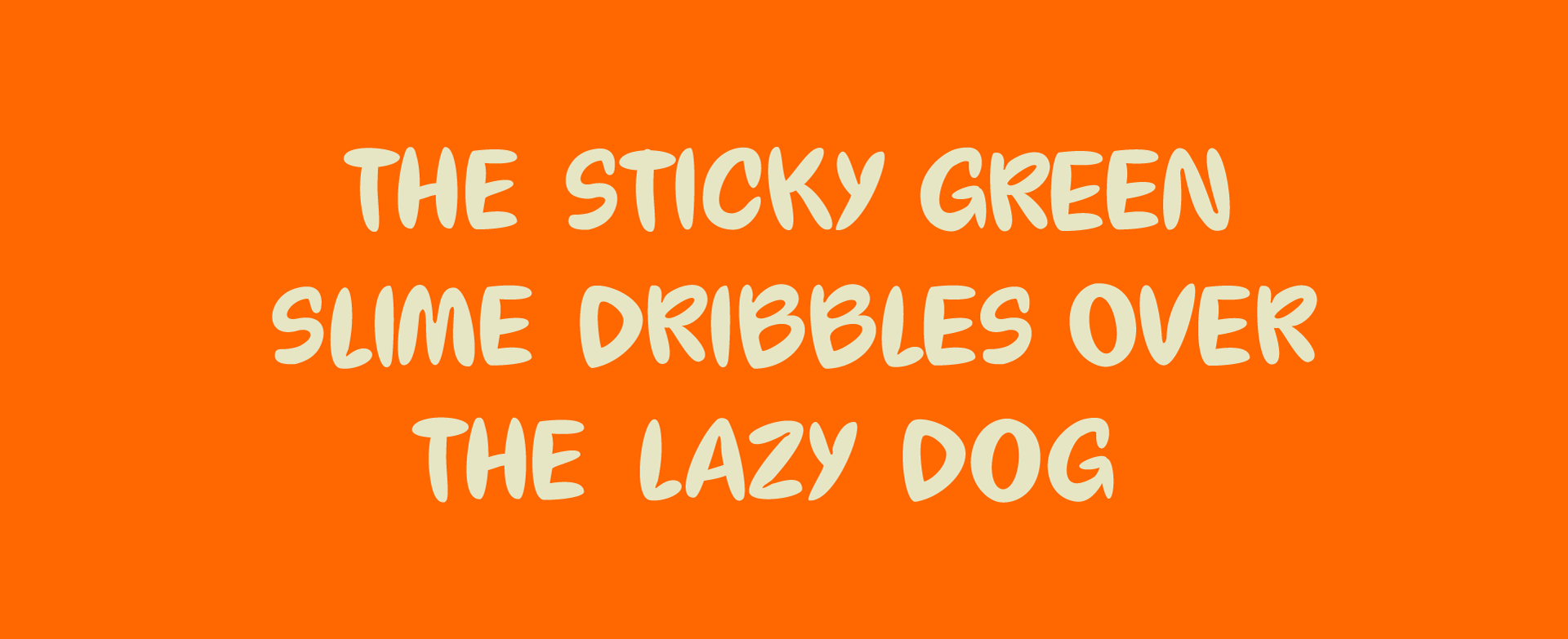
Lettering
OOO communications is where the brand becomes flexible. For that I developed a variety of playful and fresh lettering styles matching the quotes that highlight the brand's spirit.
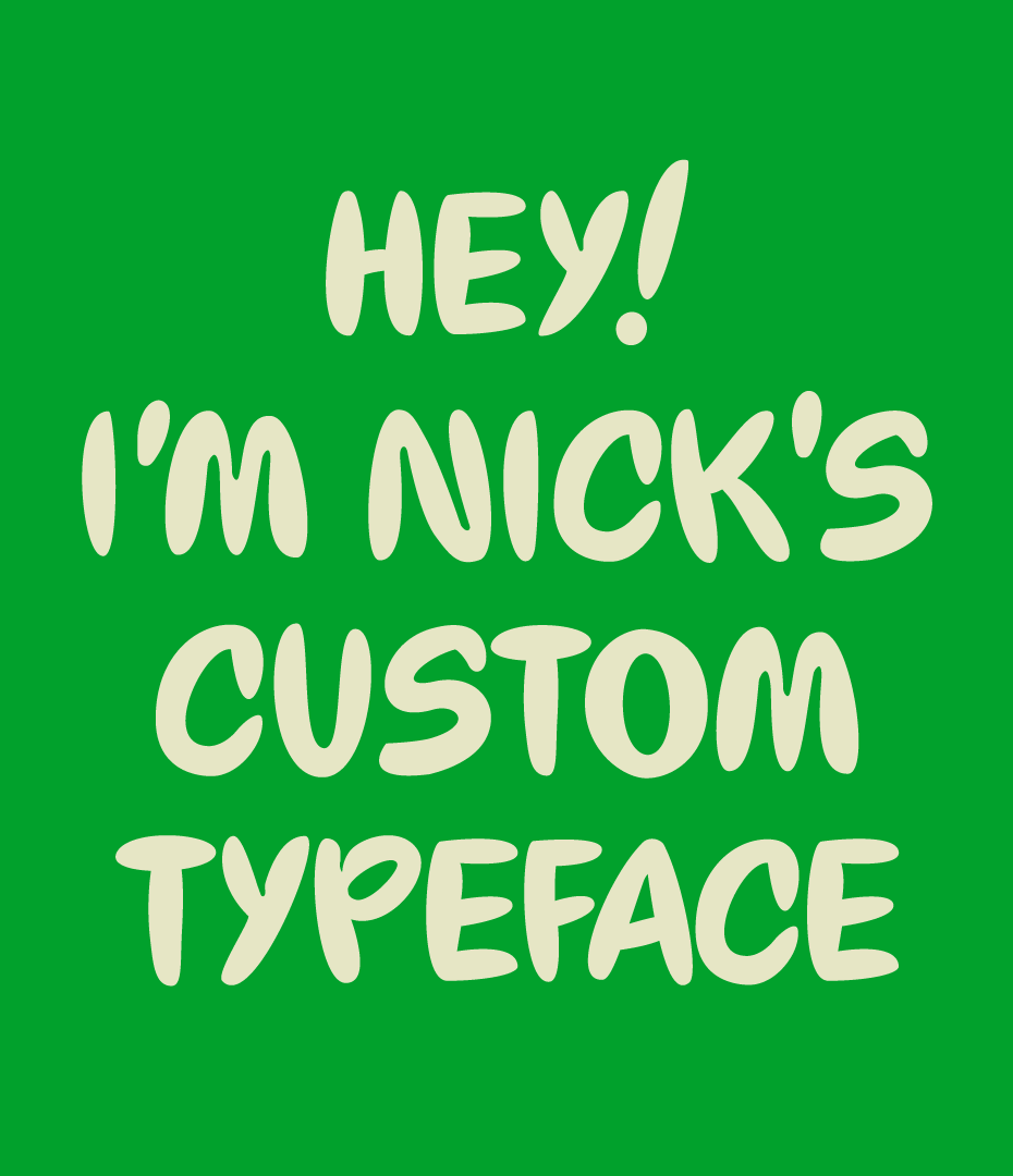
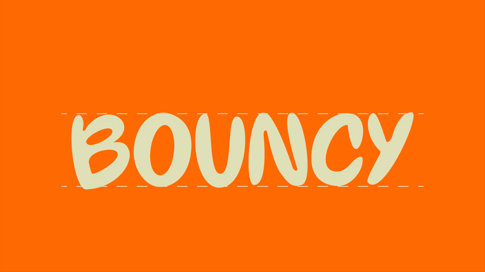
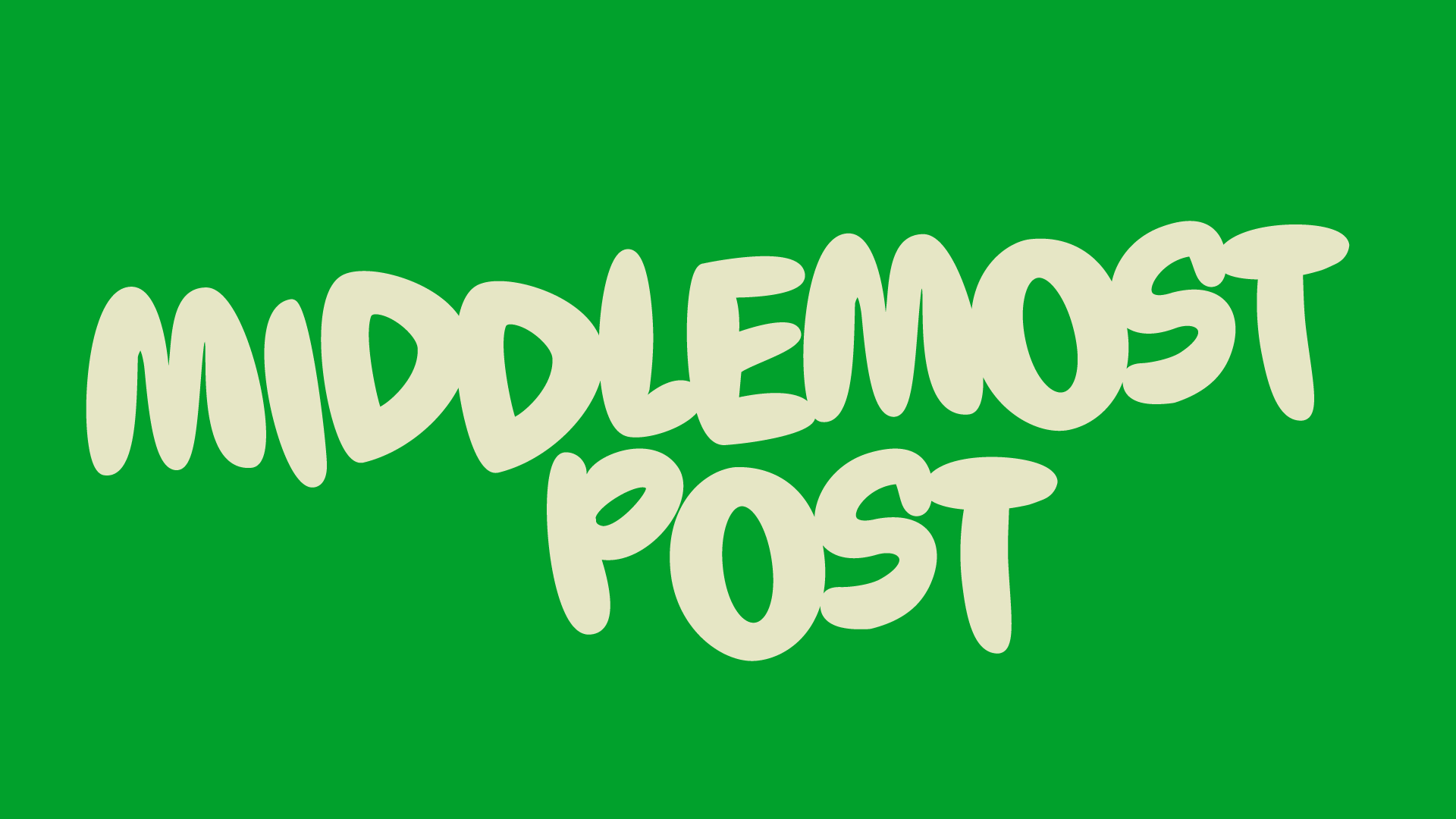
Custom Type (Demo)
I did some exploration on creating a custom typeface. Although still in its development phase, this set focuses on blending round, soft shapes and its friendly appearance– with a more edgier personality by adding more risky features. The idea is to use it playfully, making it sticky by overlapping the characters or making it bouncy by changing the line where the characters lay.
Credits
Agency: Plenty
Art Direction: Guillermo Zapiola, Victoria Sanchez, Marte Galarza
Graphic Design: Marte Galarza, Francisco Capuzzi
Lettering & Type Design: Marte Galarza
3D: Luis Lopez
Animation: Sergio Slepczuk, Juan Martin Ayerbe